Button Menus
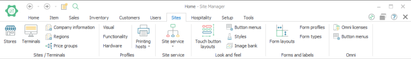
To open POS button grid menus select Sites > [Look and feel] Button menus
You can create the different menus with this operation. Menus are either attached to button grids used in the touch button layouts or to menu buttons that are part of the menus. The system has three operations to assign buttons to menus: Open menu, Sub menu and Popup menu.
In new setups it is necessary to start by creating the menus and then to define the Touch button layouts.
It is possible to set up as many POS button grid menus as are needed in the system and they can be stored there even if they are not connected to any touch button layouts.
POS button grid menus:

Button menus are connected to the button grid parts in the touch button layouts and the buttons on menus.
Each button grid menu is set up separately to the attributes of the buttons belonging to the menu. It is possible to change the number of columns and rows after the menu has been created, the system will then display a relevant message about it.
The POS button menu view opens when one of the POS button grid menus is edited or created:


The setup for the buttons in the menu is quite flexible:
- The Preview button displays how the menu buttons look according to the button attributes.
- In the Attributes section, the number of columns and rows are defined. The system divides the space the button grid has to fit the buttons in proportionally.
- With the Font selection, the font size and style are chosen; the fields in the menu header are displaying the selection.
- For solid buttons select Gradient mode as None.
- The Back color 2 option is available when Gradient mode has a selection other than None.
- In Button attributes you can choose a style already created and the attributes will be displayed. It is not possible to change the Button attributes unless you choose Select None in the Style dropdown box.
The POS menu button card opens when one of the Menu buttons lines is created or edited:

In the menu button card, the buttons in the menu are set up as functions. Some of the possibilities are familiar to those who know how to set up buttons for the POS.
General: General options for the button. Enlarge the button by using the Column and Row span.
Font: The style of the button’s font is set up on this tab.
Attributes: The color and gradient mode have a default setting that is possible to change here.
Image: By importing an image file it is possible to add and position an image onto the button. If an image is placed in the center of the button and the button also has a description the image will be placed above the description text.
Glyphs: For each button it is possible to add glyphs, one glyph on each button’s corner. What is displayed for the glyph is put into the glyph text field and then the attributes for the glyph are defined. This possibility allows you to have all kinds of signs on the buttons as well as arrows or other images.
| Last updated: | June 2020 |
| Version: | LS One 2020 |

