Style Profile View
Hospitality > Display stations > Profiles > Style profiles
What is the view used for?
- Modify the configurations for the style profile.
 Order
Order
The order styles set the background of the order and the main styles for the display station.
 Items
Items
The following styles are used per item line.
| Fields & buttons | Description |
|---|---|
| Default |
Chit - The background color is applied to the background of the item line. Line - The background color is applied to the item line |
| On time |
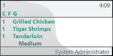
This style is used for the item line while the time is still within the production time. Chit - Font settings and background color are applied to the item lines. The font style is also applied to the station abbreviation letters until all items from that order are done on that station. Line - Font settings and background color are applied to the item line. |
| Done |
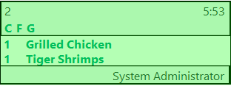
This style is applied to the chit display item line when the item is done/bumped on all previous line displays. Chit - Font settings and background color are applied to the item lines. The font style is also applied to the station abbreviation letters when all items from that order are done on that station. Line - Not used as the item line is removed from the line display when done/bumped. |
| Modified |
This style is applied when an item line has been modified after the item was sent to the kitchen stations. For an example if the qty has been changed. Chit - Font settings and background color are applied to the item lines. Line - Font settings and background color are applied to the item lines. |
| Voided |
This style is applied to item lines that have been voided. Chit - Font settings and background color are applied to the item lines. Font settings and background color are applied to the item lines. |
| Rush |
When the rush button is pressed for a line on a line display this style is applied to that order item on all stations. If the rush button is pressed for a kitchen order ticket on a chit display all items on that order will be marked as rush items on all displays. Chit - Font settings and background color are applied to the item lines. Line - Font settings and background color are applied to the item lines. |
Modifiers
Item comments, infocode text, item modifiers and sometimes assembly components are sent to the Kitchen as item modifiers. The following styles decide how these are displayed on the KDS.
| Fields & buttons | Description |
|---|---|
| Comment |
This style is applied to any comments added to the items sent to the kitchen. This style is also used for information text added from infocode selection. Chit - Font settings and background colors are applied to the comment line. Line - Font settings are applied to the comment in the Item modifiers column. |
| Infocode/item modifier |
This style is applied to item lines that are added through item modifier infocodes. Chit - Font settings and background colors are applied to the modifier line. Line - Font settings are applied to the comment in the Item modifiers column. |
| Voided |
This style is applied to modifier items that have been voided after sending to the kitchen. Chit - Font settings and background colors are applied to the voided modifier line. Line - Font settings are applied to the comment in the Item modifiers column. |
Header and footer
The information that is displayed in the header and footer is configured in the Display profile.
The following settings define how the header and footer of the chit looks like. These settings are only used if the header and footer configuration do not include style configuration.
| Fields & buttons | Description |
|---|---|
| Default header | This style is applied to the chit header if the header configuration does not include style selection |
| Default footer | This style is applied to the chit footer if the footer configuration does not include style selection |
Aggregate and history
The KDS Aggregation functionality can show the user how many items of a certain type/group are on order. For an example for a coffee barista the display could show how many Lattes there are to be made.
The following styles define how the aggregation groups are displayed on the KDS. Read further on how to setup the aggregation groups here:
| Fields & buttons | Description |
|---|---|
| Aggregate styles | |
| Aggregate header | The style of the header of the aggregation group. The font settings and background color are used from this style. Except the size of the font because the aggregation group description will be automatically fit into the space given to the aggregation groups. |
| Aggregate body | The style of the body of the aggregation group. The font settings and background color are applied from the selected style . |
| Aggregate pane |
The background color of the aggregation color is used from the selected style. |
| History styles | |
| History header | The style of the header of the history boxes. The font settings and background color are used from this style. |
| History body | The style of the lines displayed in the history boxes. The font settings and background color are used from this style. |
| History pane | The background color of the history boxes is used from the selected style. |
Buttons
Each of the button operation added to the Button profile can have it's own style applied. If the style selection is left blank for any of the buttons it will use the Default style.
The properties that are applied to the buttons are:
- Font, font size and font style and font color
- Back color
Other settings from the style setup are not being used.
| Fields & buttons | Description |
|---|---|
| Default |
This style is used for all buttons that do not have another style selected for their operation. Background color 2 is applied to the background of the button panel. |
| Next | This style will be applied to a button with the Next operation. |
| Previous |
This style will be applied to a button with the Previous operation. |
| Bump | This style will be applied to a button with the Bump operation. |
| Start | This style will be applied to a button with the Start operation. |
| Next screen | This style will be applied to a button with the Next screen operation. |
| Previous screen | This style will be applied to a button with the Previous screen operation. |
| Select start | This style will be applied to a button with the Select start operation. |
| Select bump | This style will be applied to a button with the Select bump operation. |
| Recall last bump | This style will be applied to a button with the Recall last bump operation. |
| Home | This style will be applied to a button with the Home operation. |
| End | This style will be applied to a button with the End operation. |
| Mark | This style will be applied to a button with the Mark operation. |
| Transfer | This style will be applied to a button with the Transfer operation. |
| Rush | This style will be applied to a button with the Rush operation. |
Read more about the functionality of each operation in the Button Dialog
| Last updated: | February 2021 |
| Version: | LS One 2020.1 |

